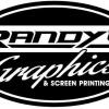
Randys Graphics 5 Posted April 1, 2011 these are the 2 logo i have come up with. would like input on what more to do or add or take away or if anyone got a better logo ideal all help would be glade helpful Share this post Link to post Share on other sites
huffgraphics 0 Posted April 2, 2011 i like the first one, minus the diamond plate Share this post Link to post Share on other sites
deth502 39 Posted April 2, 2011 yeah, the diamond plate kind of clutters it all up. maybe with a punch through of the letters so theres not so much of it? that i think, would help with the "graphics" part of it anyway, but not necessarily the "randys" part. Share this post Link to post Share on other sites
krikster 5 Posted April 4, 2011 these are the 2 logo i have come up with. would like input on what more to do or add or take away or if anyone got a better logo ideal all help would be glade helpful Yea the diamond plate look and the thin lines of the text makes it hard to read. The one with the star is better but use a bolder and cleaner font so people don't lose interest trying to figure out what it says. Trust me I spelled graphics in my name as GrapFX....I hear so many people say GRAPE FX...lol I want to pull my hair out and strangle them for not reading it right. hahahahah So I am going to make a change in it when I get it all going and change my URL that I have already bought. You don't want to take away from the name of your company by no means. First thing they taught in design classes was make things legible. A great design only works if you can read the text that goes with it. I will get my logo up and going when I get the right colors for it and the clear transfer tape so I can layer it. Share this post Link to post Share on other sites
NukleoN 34 Posted April 4, 2011 these are the 2 logo i have come up with. would like input on what more to do or add or take away or if anyone got a better logo ideal all help would be glade helpful First one. Remove that diamond-plate background as it's way too cluttered. The oval shape doesn't help much either. Share this post Link to post Share on other sites
prototype66 20 Posted April 4, 2011 +1 Lose the Diamond Plate. How about a smaller oval around just Graphics and slide "Randy's" over to the left just a bit more just overlapping the oval slightly. This is just a quickie to explain what I was thinking. Share this post Link to post Share on other sites
krikster 5 Posted April 4, 2011 +1 Lose the Diamond Plate. How about a smaller oval around just Graphics and slide "Randy's" over to the left just a bit more just overlapping the oval slightly. This is just a quickie to explain what I was thinking. I second that design!!!!! Share this post Link to post Share on other sites
thebuttontaylor 1 Posted April 5, 2011 +1 on lose the diamond plate on the first one. The second one would look beeter withe the blue ontline on the text, it makes it hard to read. Bill Share this post Link to post Share on other sites
thebuttontaylor 1 Posted April 5, 2011 +1 on lose the diamond plate on the first one. The second one would look better without the blue ontline on the text, it makes it hard to read. Bill Share this post Link to post Share on other sites