
jgeck90
-
Content Count
65 -
Joined
-
Last visited
Posts posted by jgeck90
-
-
-
I have had that same problem before. I am not sure what causes it but i always also check the preview before i cut it. For me, it would always show it in the preview so i caught it beforehand most of the time. I hardly ever use the weeding frame anyway.
-
Thanks. Can i get some direct links to the ones that are good and suggested to buy?
-
Can anyone refer me to where the best place is to get this art? Preferably already in EPS format but JPEG or AI is fine as well.
Please refer me to links to the best art for the money. I'm not looking to spend more than $80 if possible.
Or PM me with further suggestions.
-
Can anyone PM me a quote on what this would cost? This is to anyone who can make them printed.
Jeff.
-
sorry about that. It is Vinyl.
-
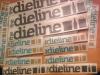
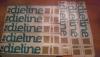
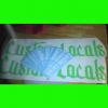
what should i charge for these simple, 3 color decals? My cousin wants to order 200 of them for his conference that is coming up. What should retail price be and a family discount? These will measure about 8" long.
Thanks.
Jeff.

-
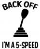
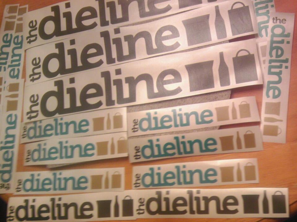
Here is some of my recent work. First being 3 color decals for my cousin. He is VERY famous in the package design/graphic design world. Check out www.thedieline.com
Others are just recent work.
Jeff.
-
Thanks a lot. Words cant explain how helpful you guys are that share this stuff.
-
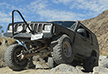
Anyone have Mud Terrain tire tracks? All Terrain will work too but i would prefer Mud Terrain. Thanks so much.
Jeff.
-
Great work!
Could you share that cross and flowers on the 7th picture?
-
Thanks. I contacted USCutter and they said that they want to make sure that the carriage is on track. Besides that they want to do some trouble shooting and other than that i guess there's nothing else they can do but have me send it back. Luckily it's under 7 months old.
-
I use both. Clear and paper both have their up sides and down sides.
Up side to clear- Clear is very professional looking for business owners.
Down side to clear- Most people complain that clear tape is a pain when applying the decal to a window. I've had multiple upon multiple complaints on this.
Up side to paper t-tape- Works very well on any type of surface whether it be drywall or a glass window.
Down side to paper t-tape- The paper tape makes it hard to see the decal and seems to roll up on the edges very easily. It also looks very unprofessional.
My conclusion- Again, they both have their up sides and down sides but i believe that if you are applying the decal in the correct temperature it should work just tine no matter what.
-
Good work.
I would suggest to edit that fox decal out. That would be the biggest example of copyright.....
-
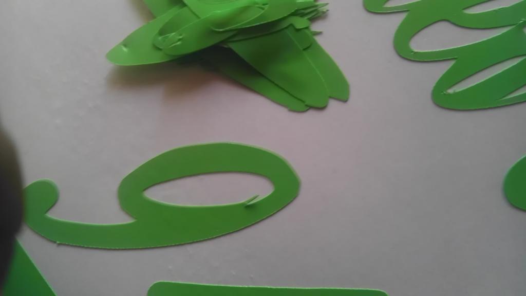
Hello, I have this random issue that happens on everything that i cut. I've tried new blades and different depths/speeds and nothing seems to fix it. This happens at least once on every cut. They are smooth letters and it makes this small cut on them.
Any ideas on what to do to fix it?


-
Where can i learn more about making these cups? What is needed? You just print a picture out and it's transferred somehow?
-
I used three different fonts... The large capital letters are Edwardian Script ITC, the cursive text is Tangerine and Phil 4:13 is Microsoft Uighur.Here's the file for the cross & dove:
Thanks so much. You are awesome. I wish i could help you as much as you've helped me!
-
Can you share the cross&dove? VERY nice work. I'm impressed. Also, what is the font name for that text?
-
 1
1
-
-
It would look better if it wasn't vectorized. Vectorizing text doesn't turn out very well with most fonts and you can see it in thepicture.
Elaborate? I don't ever have issues with the way text cuts whether i write it in inkscape and import it or if i design it in photoshop, it still comes out looking looking good.
-
Making it black and white wouldn't have anything to do with exporting is what i was trying to get at. Wasn't trying to sound like a dick.........
-
Why do you click bitmap, mode, black and white, line drawing?You can go straight to trace, low quality image, and its done.
It's just a habbit since most of my stuff is in color when i import it to Corel. This also has nothing to do with my question.

-
Everything. I import it as a JPEG. I have no clue why it says something about PDF.
-
-
Thanks for your reply.
What is the launcher?
I tried to export and tried saving and opening it in sign cut but still get the error.


Best application Tape
in Vinyl
Posted
All tapes have their up sides and down sides. As far as selling to an average customer or someone for retail sale or someone that is looking for the decal to look professional. I have found that i sell them to companies more often than the average person who wants a decal. Depending on the width of the decals sometimes i will use a combination of clear and paper so i don't waste the transfer tape (Meaning that i usually have a smaller width roll of paper tape). The next time that customer orders they usually request them to all be in clear tape. For myself i would prefer paper since it seems to work well on cars, walls, and any application as where a clear tape i have learned that it does not work well when applying decals to walls.
Jeff.