
SynFX
-
Content Count
344 -
Joined
-
Last visited
Never
Posts posted by SynFX
-
-
i would recommend a smaller(lighter) '&' symbol. You should separate the first line of things you do from the other with some kind of bar or but the window decals part on a black band with the images and letters cut out.. just my thoughts
-
I like it.. I would say keep it simple for whatever price. If the customer does not mind, do not add more work to your schedule than you have to. Just make sure you are comfortable with that going on your portfolio. That is the only thing I really care about! Well besides pleasing my customers...
-
It could be but Im no expert there. This is really made with high speed connections in mind. Most individuals seeking computer related services or products from Gossimo will most likely be able to handle the site. He has a few doctors he has made units for, you know they have a good connection!
-
changed it.. what do you think now?
-
well.. this card was made for my cousin Chris, who's father, my late uncle, passed away a few years ago. His business cards always carried the fish, as does my aunt new husband, who's business name Chris is using, also uses the fish symbol. Having said this, it seems to be a tradition of sorts for them. We are in the right area that this sort of thing does help believe it or not.
-
Check it out! No content on the site YET. The client loves it! Tell me what you think!
-
here is a remake of the ESD2 biz card.

-
how easy/hard is that avery spray mask to cut and put up? like reg vinyl easy?
-
I design in Photoshop CS2 - Corel X3 for vector/vinyl.
-
yeah the clients had a lot to say on their cards. It is the cheapest form of
advertisement any business can have. Utilizing that space is, in my opinion,
one of the most powerful things it could have. It's advertising...
-
-
Needing the late model Chevy Impala logo if anyone has it.. email it to me at mysynfx@yahoo.com - THANKS!
-
www.dafont.com www.1001fonts.com
-
its a mixture of a few graffiti fonts.
-
haha.. thats cool. happy i could inspire..
-
nah I use a COPAM.. I wouldnt trade it for the world.. BUY IT!
-
i have my cards printed at www.gotprint.com
you can do many things... through electricity who powers us..
-
haha.. thanks for the review.. I always manage to mess SOMETHING up.. Ive got no excuse! Shame on me! haha
-
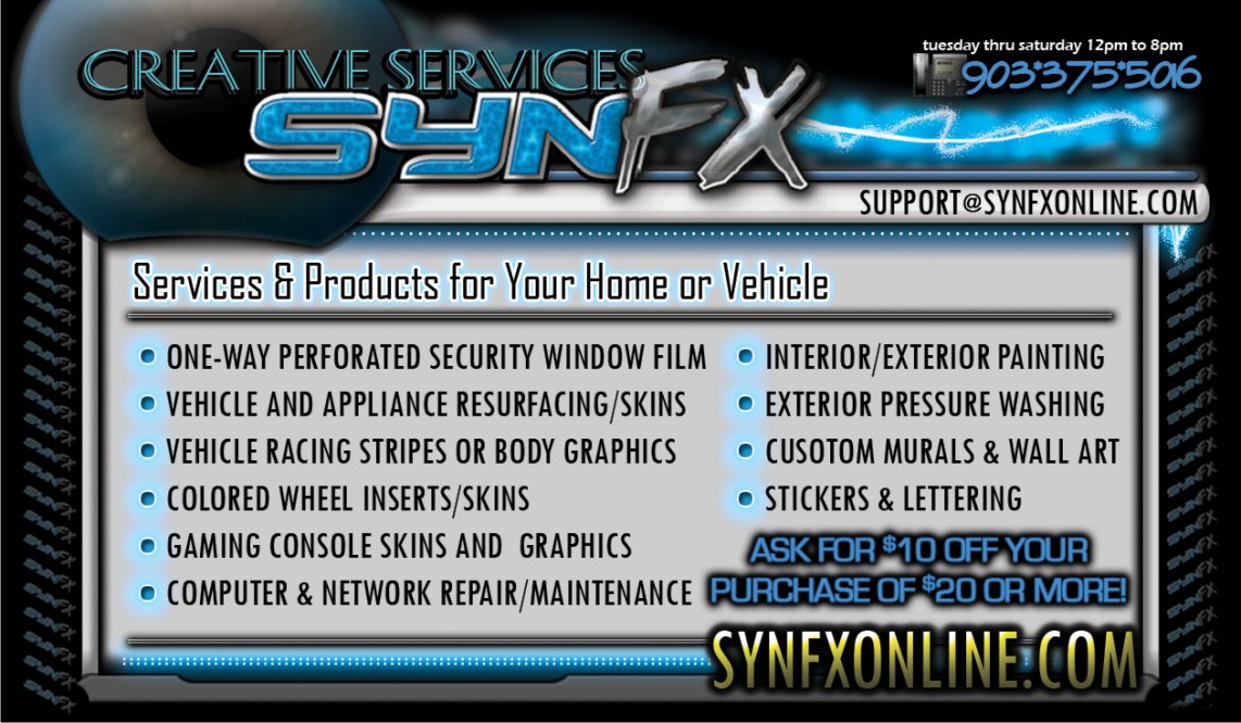
This is the PERSONAL/INDIVIDUAL side of the card.. will have a side dedicated to business services.


-
correction. www.thepiratebay.org ONE pirate now pirates. sorry everyone
-
oh man.. corel is pefect.. SUPER A+++++ - I have used Corel for years and will not touch anything else for designing, other than photoshop. I use SignCutX2 to cut.. you can get a cracked version of Corel from www.thepiratesbay.org - will need a torrent downloaded from www.bitlord.com - otherwise it runs around $800
-
thanks hot momma! hahaha u thought i forgot?
-
I use Corel Draw X3
-
yeah man those girls are wicked good! Throwing like a girl is not as bad as we thought! hahaha.. Thanks all!


Gossimopro.com IS ONLINE!
in Show your work
Posted
actually I handle the SEO. My SEO ratings are usually between 96% and 98% proficient. Doing well so far..
edit: after posting i went to whois.domaintools.com and pulled a 100% for Gossimopro.com
http://whois.domaintools.com/gossimopro.com