

skarekrow
-
Content Count
2,673 -
Joined
-
Last visited
-
Days Won
60
Posts posted by skarekrow
-
-
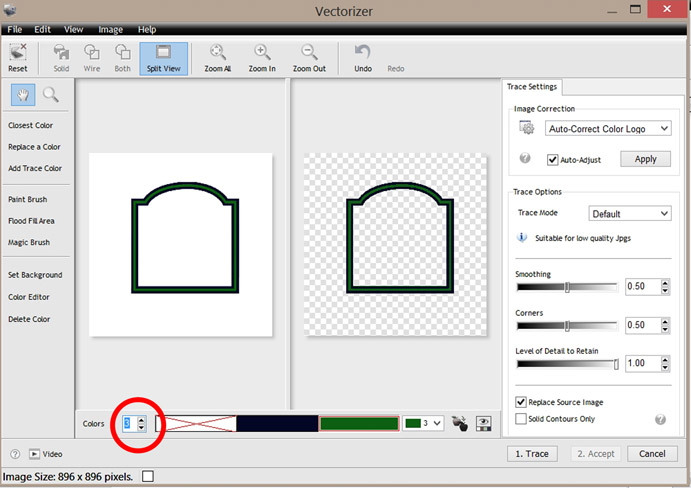
Do you need to crank up the Color Count to 3, as shown?
-
 1
1
-
-
I can take care of it... Will Pm you to discuss.
-
1
-
-
Happy 2 Oblige.
You just take a Maltese Cross Vector and use it to Punch Out it's
Shape in the Flag Vector and delete any unneeded parts.
-
If you don't need the Gradients, I can offer this;

If you need the Realism that the Gradients in your Posted Pic provide,
You'll be cutting MANY layers to achieve a ~somewhat~ similar look.
-
1
-
-
Where are these 2 Vector Files you are trying to combine?
Those 2 you Posted are Raster...
Here they are combined; (I can Zip you up a High Resolution copy if Raster is what you're after)
Otherwise, post the 2 Vectors and I'll do the same for them.
Are you planning to Cut or Print the Final? Key Word: GRADIENTS.

-
1
-
-
Don't know about Vm 'CUT' but Vm PRO's OUTLINE MODULE will
absolutely do what you are trying to accomplish.
The information on 'How' should be found in the following videos;
Check FutureCorp's VinylMaster YouTube Channel for tons of other Tutorials...
youtube.com/user/futurecorporation/videos
-
1
-
-
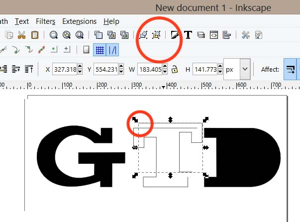
In InkScape, Ungroup (top red circle) the items, (twice, in this case) and you can select and separate
the "T" into 2 parts. If they were not lined up perfectly, you can often see the double paths
under close inspection.
-
3
-
-
Sounds like you need to have a peek at the Manual;
http://www.uscutter.com/static/PDFs/TITAN_Manual.pdf
-
I'm certainly no Trademark Expert but, There is some pertinent info here and seems to indicate
his TM of the term "I just want to" is pretty weak considering the other marks that include (and Pre-Date?) it .
This could make his weak mark difficult and costly to try to police and protect as it simply does not have
the same legal protections of a stronger and more distinctive mark.
Not so sure I'd back down too quickly if I were in your shoes... Maybe wait on something more official
than just his Bully Letter (?). Also, take into consideration how much your Phrase Shirts are bringing in
as opposed to what Legal fees might be incurred.
Perhaps try and Trademark one of your Phrases?
-
5
-
-
In Screen Printing there is a term ... "Trap" or "Trapping".
This is where the edges of 2 different colors overlap slightly.
One reason for this process is to prevent the shirt color from showing
between the colors.
When designing 2 or more color HTV files, I generally add a small
overlap for the same reason. This also reduces the layers as
double (or even triple) layers of HTV are avoided because of stiffness,
Body heat retention and "hand".
The Outline module in VinylMaster is good for adding this contour around
the individual color shapes and then weld together the Parent & Child Shapes.
-
2
-
-
Happy 2 Oblige
-
-
1 hour ago, darcshadow said:Figuring out what the font types are and recreating the logo would be the ideal way to go, of maybe ask if they have the original files of the logo that are probably already in vector format.
In Theory, you're Correct however, on the more Practical side
( for this Case, at least) the Time your gonna spend
chasing down the original Vector and/or Replacement Fonts,
you could have Manually Recreated or Auto-Traced and Cleaned
the one right in front of you.
(I spent less than 5 minutes on those Results... 5 more and it's Complete. ymmv)
-
This type of Graphic work requires a minimum of skills in
a Raster Editing Software lke Adobe PhotoShop or Corel...
Here's a leg up. Still needs a bit of Node Editing.

-
3
-
-
So there you go... Create your own, 'original' Graphic of the "F*it" idea and
make a million bucks... just like all the others that have done the same. ~eyeroll~
-
2
-
-
Also, What Plotter & Software are you using and what size are you cutting the graphic?
Rounded corners can show up on small items, particularly when produced with Low-end
Cutters/Software and/or at High Speeds.
-
Happy 2 Oblige.
-
2
-
-
This isn't an Auto-Trace... the Fonts have been replaced with
the Original Papyrus, Bradley Hand, and Especial Kay.
The first and last 2 are just gnarly by nature.

-
3
-
-
I used SignCut for a few years... Great Cutting Program.
Left it for VinylMaster Pro... An even Better Cutting AND Design
Software, IMO.
-
Don't use SCALP but, perhaps it's because the text in Ai is still Live?
Try Selecting the Text and Object>Expand before Exporting.
Just know that the Text in Ai will no longer be editable as text.
I tend to save a a copy of the Live text with my Ai files and expand the
Copy to have the ability (if needed) to manipulate as Text at a later date.
-
1
-
-
There is no Resolution in Vector images.
The png I posted is 120 dpi at 591 x 636 pixels.
Yes, you can open the Vector file and enlarge it and save as
a Higher Resolution raster image and Yes, it would be helpful if
you were planning to Print the raster in a large size.
-
I was able to Export the Paths to Illustrator to Vm, Trace the Raster and Replace the Text.
Still needs a Nudge or Few to Taste.... (mostly around all those Vertical Bars).
This is a good Example of why I use VinylMaster (and Adobe CS3).

-
4
-
-
The Fonts aren't the main problem... Foglihten No01, Carolina Mountains,
Bickham Script, & Killigrew are all available Free.
The Document is Profiled for Printing and though most of the Shapes are Paths,
about a third are Rastor and cannot be exported (as vector) to Illustrator.
Stuck with Redrawing or Tracing and Re-assembling from there.
Either way, plan on spending some time with it to replicate it exactly.
Personally, I'd take Mark's (decent) Facsimile and present it to the Client
with an Explanation of the file's shortcomings for the Vinyl Plotter.
-
QUOTE> "Then no commas was intentional per the customer."
Yup... if I had a nickel for every Client that insisted on Improper Punctuation, I'd be a Rich Man.
...said no one ever.
-
3
-
need some help please
in Vectorizing
Posted
Happy 2 Oblige